Showing posts with label paint. Show all posts

5.20.2013

spring break revisited

Remember a couple of months ago when I was bragging about all of my spring break projects? I am happy to report that I have finally completed spring break project #3: the IKEA Malm Dresser in the girls' bedroom.

It took such a long time to complete that my enthusiasm for this project has waned--or that might have something to do with the crooked drawer pulls (see below)--but here's what went down in fifty words or less:

1. Bought IKEA dresser.
2. Painted IKEA dresser (Benjamin Moore, Elephant Tusk, Semi Gloss, three coats after one coat of primer).
3. Bought vintage, mid-century drawer pulls on eBay.
4. "Installed" drawer pulls.
5. Stepped back and looked at crooked drawer pull on top left drawer.
6. Decided not to care about crooked drawer pulls.

Behold the before and after:


3.19.2013

spring break project #2

This was an easy one--painting Catcher's nightstand. It took forever, however, because I could never carve out the time to drive down to the Benjamin Moore paint store for the perfect red, which Catcher picked out himself, Million Dollar Red.

Once again I launched into a project without taking a proper "before" shot, but you can see the nightstand in the background behind Tillie.

Here it is after one coat of primer...

and the final after four coats of Million Dollar Red.

Actually, this isn't really the final final because apparently I put the handle on all wonky (Alex fixed it for me), but at least you can see the color. I have a quart of red paint that's about 7/8ths full, so there may be some more Million Dollar Red in my future...some day...when I'm bored.

3.15.2013

spring break project #1

I like to do things...and then re-do them. Especially if paint is involved. One of my greatest treasures is my little elephant side table that is the perfect size for holding a glass of wine (and not much more). Before we moved into our house last summer, I finally got around to painting it white, but there was something about the white that was too white. You know? It was bugging me for a while, so I had to tone down the white. When I found the color Elephant Tusk from Benjamin Moore, which I'm actually using for another spring break project, I knew it was a sign. Unfortunately, I don't have a great solo pic of the elephant beforehand. But you can see it in all its shining, white glory behind Tillie in the photo below. The bottom two pictures are "after" shots. Can you tell the difference? I know you can (or else just trust me on this one).


3.05.2013

the un-painting

When we were painting the bathroom several months ago, we (I mean I) forgot to paint the inside of the bathroom door the same color as the rest of the wood trim. It bothered me. But I didn't feel like hauling out the paint can, stirring it up and getting the paint brush messy after I had put everything away. At some point I solicited Alex to finish the job, and he did. The only problem is that he also painted the outside of the bathroom door (the side facing the hallway). This would have been fine except the trim in the hallway is a different color than the trim in the bathroom, so we had a random blue-grey door in our otherwise white hallway. It bothered me.

After staring at the door for months--wondering when I would be bored enough to paint it back to its original color--I noticed a tiny imperfection in the paint last Saturday morning. It was kind of a hole in the paint, so I pulled at it and to my surprise (and delight!) I peeled a long strip off the door. Just like that--no mess, no fuss, and no damage to the layer of paint below. Catcher was standing there as it happened, and suddenly I had a Saturday morning project that everyone was excited about. Check it out:


The story isn't quite over yet, however, because only about 90% of the paint has been peeled off. It turns out that the project works better when Tillie is napping because otherwise she tries to eat the paint scraps that have fallen to the floor. I'll finish it someday.

10.29.2012

another day, another can of paint


Now that I'm on a roll--pun intended...sorry, that was a bad one--with the whole painting thing, I can't be stopped. This weekend I tackled a bookshelf, which I kept calling a dresser and Catcher corrected me saying "It's a shelf," in Catcher's bedroom. This was going to be my first project when we moved into the house. I was going to paint it before we left on our trip in July. I finally got around to it in late October. Unfortunately, I don't have any good before pictures of the shelf (I almost typed "dresser") itself because I didn't think about it until it was already coated in primer, so you'll just have to trust me that it looks better. I ordered the red star storage bins from Pottery Barn Kids last week. I think they're cute, but I was totally tricked on the size. I guess I could have read the measurements, but they appeared larger on the website than in real life. They look a little dwarfed on the shelf and don't hold as much as I thought. Oh well...

I don't think I've posted a picture of what Catcher's bedroom looked like before we moved in, so here it is:


Here are two more work-in-progress shots (notice the shelf in the corner on the second photo).


And here is how his bedroom looks today. I still have plans to do something with his bedside table. I'm not sure what exactly, but it will probably involve another can of paint.

10.25.2012

call me crazy

I guess because I've named purple the color of crazy, you can call me crazy. This week I've painted not one, but two, more things in the house purple. Number one was the front door. It needed a new look. I'm not a big fan of green--unless we're talking lime green--so it was time to get rid of the high school gymnasium floor green that marked the entrance to our home. Take a look:


Below is the door after I got my hands on a quart of Martha Stewart paint from the Home Depot. I had to suffer no less than thirty mosquito bites on my legs to get the job done one humid afternoon, but it was worth it.

Second to come under attack from my paintbrush was the fireplace. It suffered the same gym floor syndrome as the front door but worse. Check out the chips and scratches from the before pictures.


Here's a shot of the room with the new purple fireplace. From the other side it almost appears black (which was actually my intention, despite my craziness).

10.16.2012

the color of crazy


I've already noted that purple is the most-often cited favorite color of crazy people, so I must be crazy. Although yellow is my current favorite color, I can't get rid of the purple. No matter how hard I try to debunk it, purple will always be my first favorite color. This weekend when I was ready to repaint the antique trunk in the girls' room the only color "speaking" to me was my real favorite.

The trunk belonged to my great-grandmother--and namesake, Sarah Gordon Sprinkel--and it has been with me since I can remember. It was my toy box as a child, clothes storage in college and coffee table in New York. It has gone through several facelifts in my possession, and here's a quick rundown of the colors that I remember painting it over the years:


This is where we ended up after my most recent makeover:


I only applied one coat because I liked the unfinished look and subtly visible brushstrokes. I'm not completely sold on it yet, but at least I'm not afraid to attack it with another layer of color. The purple is bright, but I kind of like it next to the turquoise bed and bright quilt.

10.11.2012

land of knock off

Jenny Lind Bed, Land of Nod

This is the Jenny Lind twin bed that I wanted to get Scout from Land of Nod. I loved the look, but I did not love the $549 price tag--especially considering I'll change my mind about it before she grows into it. Furthermore, I pretty much refuse to pay retail. With that mindset, I set out to do it on my own. Step one: find a reasonably priced Jenny Lind twin bed.

It turns out that step one wasn't so easy. I found a cheap Jenny Lind head and foot board on target.com, but the reviews were horrible, and it was apparently impossible to find the correct bed parts (whatever they're called) to assemble it. The price was $139, so I considered pulling the chord until I revisited it to find it was no longer in production.

My next venture was consignment/antique/vintage furniture stores in Austin. No luck. Twin beds are pretty tough to find (in general).

All the while I was keeping an eye on Craigslist hoping for one to show up. And then one did. A guy in San Antonio was selling a Jenny Lind twin bed for $150. I made Alex text him--I'm still a little freaked out by Craigslist after the whole killer thing--and he made an offer for $135. The guy accepted his verbal offer, but the only catch was that Alex had to drive down to San Antonio (1 1/2 hours away) to pick up the bed (hoping it fit into the Explorer) and be back in Austin in time for me to take Tillie to her doctor's appointment. We basically had a 3-hour window to execute, and Alex had to stop for lunch and gas.

He made it (and the bed fit!). This is how it looked when it first arrived in our house. Although the structure wasn't exactly like my Land of Nod inspiration, I knew I could work with it. I was eager to paint it, but more anxious to move Scout into her "big girl bed," so I let it hang out looking like this for a few weeks.

Finally I couldn't stand it any more, so I had Alex move the bed outside so I could prep it for the paint job.

Fifteen minutes and two cans of spray paint primer later, I was ready to go back to the Home Depot to finalize my color choice. You might not think so, but there are at least twelve shades of turquoise (or azure, as Land of Nod calls it). I had to go back for two different sets of swatches until I found the color I wanted.

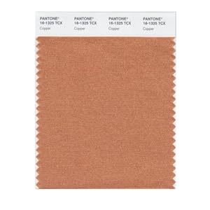
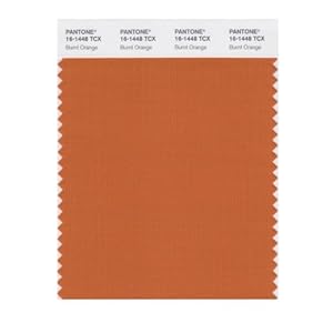
In the meantime I was looking for the perfect quilt. I had an idea, and a search on eBay turned up exactly what I wanted: an Indian kantha quilt. I just had to decide on the color. I changed my mind six or seven times until I stumbled upon this print in bright orange.

In the end tahitian breeze is the turquoise that won. 

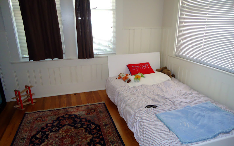
The end result. Not bad for $135 bed, an $18 can of paint and a $58 quilt.

I just hope this picture of Scout isn't a reflection on how she feels about her new bed.

Just kidding...she loves it! It was the fancy pillow on top of her bed that she was throwing a fit about. The girl likes to do her own accessorizing.

12.21.2010

plan c


I returned to Danielle's condo this morning to create the linen faux finish to serve in place of the grasscloth covering that was our first (and best) vision for the 21-foot wall. I would love to say that the project went beautifully--I took my trusty "assistant" Alex along with me--and that we achieved a look any professional faux finisher would be proud to call his own. Not so much. The wall looks like an afterthought; it has no relation to the rest of the space, and the work looks like something our two year-old could have done (although he would have a hard time reaching the top of the nine-foot wall). Thanks for nothing, horsehair flogger.

Although I was a bit distraught at first--because I sold Danielle on the whole idea and boasted I would have no problem creating it--I've gained a little perspective and realize it's a learning experience. It's only paint, after all. So now I guess my challenge is to come up with a Plan C for the wall. While I was standing in the living room watching the disaster unfold before my eyes (the paint drying did not help the effect in this case) I focused on what we could do with this giant wall. And then it kind of dawned on me that maybe the answer is not to give the wall some sort of texture and try to make it a focal point. Maybe we should try to make it fade into the background and concentrate on the amazing city view that the perpendicular wall of windows creates. Isn't that the point of having the condo in the first place?

So Plan C, at least as it stands at the moment, is to paint the wall the same color as the rest of the living room and make it a wall of function (hello, TV!) versus a point of interest. If that makes any sense at all...

12.15.2010

color geek


I'm a total nerd. Not only do I actually like school (and attended classes when I was in college, as I've stated before), but I get excited over really nerdy things. Like tonight when I got home, the Farrow & Ball  colour--"colour" because the company is British--card and brochure that I had ordered a couple weeks ago online was in my mailbox. Woo-hoo! Now I get to sift through 132 paint chips and get inspired to choose colors for rooms in a house that I don't even own yet. What (nerdy) fun!


12.12.2010

the flogger


Behold: the horsehair flogger. Delivered to me through the wonderful world of eBay. I hope it's worth the embarrassment I suffered, and it performs the faux finish to Martha Stewart standards. I can't wait to get started--21 feet of wall plus one little flogger should keep me busy for a while.

12.02.2010

painter's arm


So Danielle's project is finally underway. I'll post pictures when there's something a little more interesting to show, but in the meantime this is what I did today:

- painted a 21-foot wall
- sang showtunes to myself
- painted a chalkboard wall
- laughed out loud with nobody in the room
- painted another wall...and another wall
- wondered if it's considered "work" if you're doing what you love
- cleaned up my mess
- skipped lunch
- thought about work only long enough to realize I wasn't thinking about work
- gazed at downtown Charlotte from above
- experienced vertigo while suspended on a 6-foot ladder adjacent to a wall of windows
- drove myself uptown and back without making a wrong turn
- tried a new sandwich from the Common Market
- drank a cold beer in a hot bathtub (and wished it was a jacuzzi tub)

11.20.2010

fake it

marthastewart.com

When in doubt, look to Martha Stewart. Faced with the dilemma of finding a less expensive alternative to the grasscloth wallcovering I wanted to use in Danielle's condo, I've been researching faux finishes that would create the dramatic, textured effect she wants. I've looked at everything from metallic finishes (too blingy!) to venetian plaster (too medieval!) until I finally came across what could possibly be the perfect look for her classic, casual [Belgian Modern] style--a fine linen faux finish. The linen look sold me because linen is the key element in Belgian Modern interiors. 

I hope she likes the idea...the next challenge will be to actually create the look myself (at least the process will provide anecdotes for the blog). I did take a faux finishing class while I was in design school, but that was five years ago. At least I remember to test my technique on a practice board before applying it to the wall.