The other night Alex and I had our first date night since Scout was born--how did that three months fly by so quickly? We put on our coolest gear and headed to the local hipster joint where we ate cool food and drank cool drinks. We had a great time sitting at the bar making fun of the other patrons (everyone does it) and talking about anything but the kids. Then an hour and a-half into the evening, Alex turned to me and asked, "So how long are these 'date nights' supposed to last?" And we thought we were cool...hahaha....
10.29.2010
10.28.2010
survey says...
"Cute house...just too small."
That's the feedback we received from our showing yesterday. We actually have another one tomorrow evening. I didn't have time to bake cookies tonight (ha! ha!), but I'm hoping they'll like the house anyway.
That's the feedback we received from our showing yesterday. We actually have another one tomorrow evening. I didn't have time to bake cookies tonight (ha! ha!), but I'm hoping they'll like the house anyway.
10.27.2010
another quickie
I'm no longer surprised when the call comes in giving us just a few hours notice that we have a showing. I definitely have the prep-and-go down to an art form, but what does surprise me is how my perception of how we left the house in the morning differs from reality. Thinking we had left the house in show condition, I quickly discovered I was wrong (and sighed with relief that I was able to run home during my lunch break).
Wet towels hanging from the bedroom and bathroom doors? Not a great impression for a prospective buyer. Did you notice the training potty on the floor of the bathroom? That's another thing you want to hide...
At first glance Catcher's room seemed presentable, but then I took a closer look inside the crib littered with blankets and stuffed animals. I also noticed my closet door was left open and a pair of Catcher's jeans had been left out to dry. All easy fixes but things you don't want to highlight during a showing.
So now I guess we just wait for feedback. But as I've expressed lately, I'm really not interested in any more feedback...we just want an offer.
10.26.2010
hide away
If you've looked at my blog then you've seen one of my greatest creations (not counting the kids, of course)--the "cow chair." Four years ago my mother-in-law summoned me into her basement and offered any of the treasures laid out before me. From the far corner, I saw a beat-up, flood-damaged and sadly neglected dining chair: "I want that," I said. "You want that?" From the moment I spotted the unfortunate thing, I had a vision. I found its brother and the pair made the 859 mile journey from Milwaukee, Wisconsin to Charlotte, North Carolina in a poorly-packaged giant brown box.
Arriving in no worse shape than they had left, the two chairs quickly became a project and made the stunning transformation from dejected dining chairs to conversation-starting occassional chairs. I love them (and yes, you can sit on them), and I think the juxtaposition of the cowhide and the bright--almost garish--turquoise paint is what makes everyone take notice. I thought I was the only one with this idea until I stumbled upon Kyle Bunting while surfing the Internet last night. How did I not know about this guy before? His designs take my vision to the next level, and I have to admit that I'm slightly obsessed. Here's a look at some of his work:
Images from Kyle Bunting
10.25.2010
no comment
Today our realtor hosted a broker's open to get some traffic moving through the house. I came home to a warm house smelling of home-cooked chili and jalapeno cornbread along with some "constructive criticism" from the realtors who stopped by. At this point, I have to say that I'm honestly not interested in what the realtors have to say about neutralizing and staging and whatever--I just wanted people in the house hoping that someone out there has a client who actually wants to buy a home. That being said, I did follow the "suggestions" our realtor gave the last time she walked through the house, and I pulled back all the curtains and put fresh flowers out for a "pop of color," which is quickly becoming my least favorite phrase, by the way. Here's a look at the house prior to the open (note the tulips on the coffee and dining room tables):
With two growing kids and my sanity waning, the house isn't going to get in any better showing condition. We've changed the price; we've changed the kitchen; we've changed the exterior and the yard, and still nothing. The only thing that hasn't changed in this equation is the realtor, so maybe we need to think about looking elsewhere.
10.22.2010
color wheel
On my wish list this year is the Pantone Fashion + Home color guide. It's the mother of all color fan decks created by the world-renowned authority on color. If you've ever wondered how designers all seem to come up with the same "hot" color for a particular season, it's because the masterminds behind Pantone have forecasted color trends years in advance and essentially tell us what we're going to like. Freaky, right?
In case you're wondering, the color for 2010 is turquoise, or Pantone 15-5519 TCX. I can't wait to see what they tell us to love in 2011...
10.21.2010
pouffe!
Is it a seat? Or an ottoman? Maybe a child's chair? A nightstand? A place to rest your drink? The Moroccan pouffe is all these things. The rules of the pouffe are that there are no rules (but you should definitely go bold with your color choice).
 |
| Elle Decor |
 |
| Elle Decor |
 |
| desire to inspire |
 |
| Domino |
10.20.2010
hanging inspiration
| Ingo Maurer's Zettel'z 5 Chandelier |
Generally speaking I'm not a romantic, but there's something about the love letters suspended from German artist Ingo Maurer's Zettel'z chandelier that speaks to me. Like discovering a piece of artwork you're drawn to, sometimes you just don't have a reason for why you find something intriguing. I will say, though, that the fact that the chandelier comes with blank pages that allow you to participate in its design makes it even cooler. If I had an unlimited budget and a space to hang it, the Zettel'z would be mine.
Images from YLighting
10.19.2010
building + house
With all this talk about the box house, I've neglected to pay homage to the original box building that was home to the Bauhaus movement (Bauhaus in German means "house of architecture") in Dessau.
 |
| The Bauhaus Building, Dessau Image from Wallpaper magazine |
Without getting too textbook, Bauhaus style is characterized by plain white walls void of moldings, virtually frameless windows, open floor plans and the use of concrete, steel and glass as building materials. You should also decorate with primary colors (think Mondrian) and modular furniture. Luckily I'm not a purist and would never decorate my home strictly adhering to the "rules" of one period or style. I believe in mixing and matching because living in a bubble is much less interesting than living in a box.
10.18.2010
smallest house in charlotte
Yesterday I felt like I lived in the smallest house in Charlotte. Sundays tend to do that to me. When the husband and the kids and I are all trapped inside the house for the afternoon, I start to feel my sanity slipping away...
Then tonight I remembered that I've actually been to the smallest house in Great Britain. It was about ten years ago, and my then-boyfriend has a picture of me standing by the door on his website, but the images are copyrighted so this will have to do as a substitute:
Just replace the old woman in the red cape with a younger me in a pink beret, and you get the picture. Here's a look at some other tiny abodes to keep in mind when 847 feels minuscule:
Then tonight I remembered that I've actually been to the smallest house in Great Britain. It was about ten years ago, and my then-boyfriend has a picture of me standing by the door on his website, but the images are copyrighted so this will have to do as a substitute:
 |
| treehugger.com |
 |
| Wacky Archives |
 |
| The Fire Wire |
10.15.2010
hippie shiek
When asked to describe my personal style, I'm tempted to say "a little bit country; a little bit rock 'n roll" (mostly because I think it sounds cool), but my true style is more along the lines of a little bit hippie, a little bit 80s and a little bit mid-century. Keeping this synthesis in mind, I've found my perfect sofa: the Mah Jong Modular Sofa designed by Hans Hopfer for Roche Bobois. The patterns are hippie, the colors are 80s and the style is mid-century. To say I'm obsessed would be an understatement. Is it not the perfect piece to make a statement against the clean lines and concrete floors comprising the box house?
The bad news is that the sectional--customized with your choices of fabrics, bases and finishes--would cost around $10,000 [sigh]. But the good news is that a trip to their showroom can inspire copycat looks by opening your mind to mixing unexpected pattern and color combinations. That's worth a trip to New York...
Photos: Roche Bobois
10.14.2010
designer black mulch
As the man of the house, Alex is in charge of exterior projects. We--and when I say we, I mean Alex--have been meaning to put some finishing touches on the front yard for a few months now, but time always seems to slip away. To Alex's credit, he does work on average six days a week, but today he had a rare day off and took the opportunity to work in the yard. He found some guy in Concord, NC with "designer black mulch" and had it delivered this morning. Even though I'm not that big on plants and stuff, I have to admit that it does make the curb more appealing (and the black is way cooler than any mulch I've ever seen).
Is the mulch going to do it? Will the house be under contract before the pitchfork is put away?
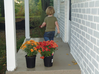
Alex also picked up some mums to add a little autumnal cheer to the front and side porches. Catcher got in on the action and re-arranged the plants to his liking (below).
10.13.2010
mirror, mirror
Abracadabra! To make the living room appear bigger, I decided to go with the antique tiled mirror from West Elm. For $149, I decided the money was worth it if this is truly the trick that will sell our house.
Will it work? Here's a look at the living room before and after:
Will it work? Here's a look at the living room before and after:
I like the mirror. I think it will help with lighting in the room; however, I decided not to take the advice of our realtor to put topiaries--or "Miyagi plants" as Alex calls them--on either side of the mirror to add a "pop of color" (I love realtor speak, by the way). Instead, I opted for the glass vases that were previously stationed in our non-working fireplace. Even though we're trying to appeal to the masses, I couldn't bring myself to concede to such a generic, catalog look as fake plants on the mantel.
10.12.2010
in case you're wondering...
The answer is yes. I'm still stalking the box house. This weekend I drove by with the kids and when Catcher asked where we were going, I told him we were checking in on the box house. For the next two minutes "box house, box house" reverberated through the car in his little two year-old voice.
Picture of the box house taken from inside my car. The crack in the windshield occurred sometime while I was in the hospital giving birth to Scout, so it has sentimental value.
Picture of the box house taken from inside my car. The crack in the windshield occurred sometime while I was in the hospital giving birth to Scout, so it has sentimental value.
10.11.2010
casting call
As parents, we all think our kids are the most beautiful, the most talented and the most well-behaved. So indulging in the spirit of my inner-parent, I entered Catcher in the Gap Kids' Casting Call this weekend. He could totally be a model, right? (That's a rhetorical question, Mom.)
10.08.2010
reflections
Our realtor has suggested we place a mirror over the mantle to create the illusion of space in our small living room. I don't know if this suggestion is just more realtor hocus-pocus (remember the granite counter tops that were supposed to bring instant offers?) but I figure we should try anything at this point. Tomorrow I plan to venture out with the kids on a mirror mission...wish me luck!
 |
| West Elm |
Leave to West Elm to create an inexpensive piece (antique tiled mirror, $149) with a vintage vibe that brings a little personality to your space. The last thing I want to do is invest in something--no matter the cost--that I can't envision in my next house. I could definitely bring this one along for the ride.
 |
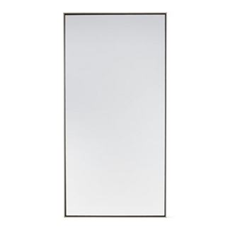
| Design Within Reach |
Simple, modern, beautiful: the Mondrian mirror would work beautifully in any future home (especially a box house).
I could definitely find a place for this mirror in my next home, but I don't know that it would do much in this house to create that illusion of space we're going after.
 |
| Horchow |
I once saw a floor jigsaw mirror, similar to the one above, photographed in a magazine and I've been slightly obsessed ever since.
 |
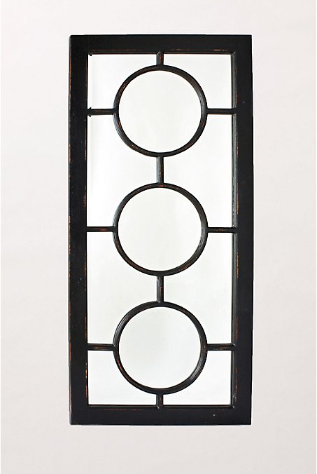
| Anthropologie |
Turn this one on its side, and you have a pretty cool mirror that makes a statement all its own.
Subscribe to:
Comments (Atom)


