6.30.2010

summer reading


I love books: I read them; I decorate with them; I give them as gifts. I wish I were one of those people cool enough to give my own books away when a friend asks for a recommendation, but I always want them back. When my husband and I moved to Charlotte from New York City, two-thirds of our U-Haul was packed with boxes of books. We did not have a sofa or a coffee table or a dining room table and chairs (or even a dresser for our clothes), but we had The Catcher in the Rye, The Great Gatsby, American Psycho, When Pride Still Mattered, every Harry Potter and hundreds more to accompany us on our trip.

As much as I love books, however, they've always created a challenge for me while decorating. I've never been able to find the "perfect" bookshelf, and I quickly become bored with my arrangements. I once found cantilevered shelves from Ikea that I forced my husband to painstakingly hang--seven feet high--around the perimeter of our spare bedroom. The actual effect wasn't quite as magnificent as I had imagined it, and when I became pregnant and we switched bedrooms, the bookshelves had to come down after I had nightmares of one crashing down on my head in the middle of the night. Ten generous holes in the wall and a pint of Spackle later, my husband made me promise to put a little more thought into the next project that involved the hanging of shelves (apparently studs are hard to find).

Since putting our house on the market, we've packed up several boxes of books and moved them into the attic, but I have found a suitable alternative for those that remain in our bedroom:


A tower bookcase is great for small spaces and architecturally interesting. I found ours on overstock.com, but I've seen similar versions from Design Within Reach and CB2. In our next home, I hope to corral all our books together to create a grand impact on a singular design space. Of course, there are no guarantees that I won't change my mind. In the meantime, however, here are some great shelving solutions where books take center stage in a room's design:

I just received my copy of the July/August issue of Elle Decor, and I fell in love with this room from the mid-century Hollywood home of Lynn Harris and her husband Matti Leshem. I want these shelves; I haven't shown my husband yet.

Image from Domino magazine

Image from Decor Pad

Two reasons I'm drawn to this design: 1) the books are color-coated (I once spent hours dividing my books into color groupings to achieve a similar effect) and 2) the reading chair is covered in F. Schumacher's Chiang Mai fabric.

Image from Veranda

Image from Elle Decor

Image from Apartment Therapy

6.28.2010

a very merry un-birthday


When you're about to turn two years old, you don't understand the difference between June 26th and July 9th, so its okay to celebrate your birthday a couple weeks early as Catcher did this past weekend in Milwaukee. Amongst dinner with the great-grandma, a day trip to Chicago to visit my friend and her new baby, a Tom Petty concert and a high school reunion, we were able to squeeze in a quickie birthday party for Catcher...phew!

Three cousins plus two next door neighbors mixed in with a little cake and ice cream and a fancy sprinkler in my mother-in-law's front yard equalled an hour-and-a-half of pure birthday bliss. The weather was beautiful; the kids had a blast; the parents didn't lose their minds (note to future self: keep birthday parties short and simple). Although I don't have any themed bits of birthday craftiness to share, here are some pictures from the impromptu yard party:

The shark on the bottom of his trunks may be fierce, but Catcher's not sure if he's ready to take the plunge.

Then again, the water does look fun...

A helping hand from Dad moves the action along.

 The attention span of a two year-old means the fun is over almost as soon as it began.

Cut to the cake...

Yum!

6.23.2010

a great place by a great lake


My son is home sick today, it's 97 degrees outside and I need to start preparing for our weekend trip to Milwaukee where we'll party like it's 1995 at my husband's 15-year high school reunion. I'm 35 weeks pregnant, by the way, and the cutoff date for flying is 36 weeks. In addition, Catcher is 23 months, three weeks old and still qualifies as a "lap" baby (i.e. free ticket) on the flight, so it should be an interesting trip.

For those of you who've never visited Milwaukee, I have to say--not because I've been brainwashed by my mother-in-law--that it's actually a nice place and not just the city that made beer famous. A word to the wise, however, is to avoid the months of November - April. Other than Laverne & Shirley, beer, brats and Butchkies, here are some highlights from "the good land."

The Milwaukee Art Museum (MAM) designed by Spanish architect Santiago Calatrava was the first Calatrava-designed building in the United States (go Milwaukee!). Overlooking Lake Michigan, it is truly an architectural marvel. One of Alex's friends was married here in 2007, and we got some great interior shots from the event:

interior view overlooking Lake Michigan

 architectural detail

Alex and me celebrating at the reception inside the MAM


Is that burger swimming in a plate of butter? If you have to ask then you haven't visited Solly's Grille in Milwaukee. Although I'd like to be on board in endorsing this gastronomical wonder, I have to admit that just one (people here order them in twos) left me feeling a little sluggish and underwhelmed. Sorry, honey!

Photograph of Milwaukee's Third Ward by local photographer Jonathan Bailey

In my opinion to be considered a great city, you need a great downtown area and Milwaukee's Historic Third Ward does not disappoint. This is where you'll find your typical downtown delights like trendy boutiques, fashionable urban dwellings, art galleries and a bustling nightlife. Does it sound like I'm writing a tourist guide?

View of Milwaukee from Lake Michigan; photo by Ken Wardius

But perhaps the best thing about Milwaukee is that it's only 90 miles from Chicago. Although both cities are bordered by Lake Michigan, you cannot see Chicago from Milwaukee on a clear day. I fell for that one.

6.22.2010

all jacked up


I'm not British, nor do I pretend to be (as my sister pretends to be Irish...don't ask). However, I do find the Union Jack flag to be somewhat of a style icon and think its classic red, white and blue palette would be a great starting point for decorating Catcher's next room. I am aware, of course, that the American flag is also comprised of red, white and blue but it feels a little country to me when used in decoration (unless we're talking about a painting by Jasper Johns).

During the year that I attended the New York School of Interior Design, I was taught that a rug should be the first thing you choose when decorating a room. Although I'm not one to follow the rules steadfastly, I do think a Union Jack rug is an excellent launching pad for designing a little boy's bedroom. My first choice would be the one Vivienne Westwood designed for The Rug Company (pictured below; photo courtesy of The Rug Company), but its hefty price tag forces me to search for a suitable alternative.


While I'm looking for a less-expensive option, enjoy these other rooms incorporating the Union Jack motif:

One of my favorite all-time spaces once featured in Domino magazine. Although the Union Jack reference is subdued, it balances beautifully with the pristine white room and artwork by Damien Hirst.

Another great showcase of the British flag pictured in the now-defunct Domino magazine.

Interior by Dan Marty featured in the March 2009 issue of Western Interiors & Design. Two things I love: antlers and the Union Jack.

Another room designed by Dan Marty scattering the flag motif on pillows throughout the room. Image from House and Home.

A vintage quilt serves as the main focal point in this quaint bedroom; photo courtesy of Elle Decor.

The Jubilee wall hanging designed by Vogue's Lucinda Chambers for The Rug Company made tapestries cool again when it was introduced in 2002. Photo from House to Home.

6.21.2010

going tribal


Lately I've been obsessed with all things ikat (pronounced ee-kaht; please don't say eye-cat). From textiles to furniture to fashion, I love the bold colors and patterns of this centuries-old timeless element of design. Inspired by Madeline Weinrib's classic french chairs upholstered in a plum ikat print (above), I'm already thinking of my own interpretation for a bench that I purchased over a year ago at a local golf store that was going out of business. But more on that later. For the moment, please enjoy the many faces of ikat:


1. Madeline Weinrib ikat chairs: LA Design Concepts
2. Fabrics by Donghia
3. Rug: ABC Carpet & Home
4. Pillows: Pottery Barn
5. Bedding: Williams Sonoma Home
6. Bowl: Anthropologie
7. Wallpaper from Mercury Design Studio
8. Fabric by John Robshaw
9. Gucci spring 2010 ikat dress: style.com

6.20.2010

free entertainment

Photo from Creative Design

Last year on Father's Day (my husband's first) we celebrated with some friends at Pops in the Park--free concerts given by the Charlotte Symphony on Sunday evenings during the month of June. Loving all things free, we were eager to pack our cooler full wine and appetizers and enjoy a night of entertainment under the stars. At the time our son was 11 months old and not quite independently mobile, so we could easily get a handle on him. We decided to make the concert our Father's Day tradition, so it will be interesting to see how we deal with a kid three weeks shy of his second birthday (all hopped up on apple juice and cheerios). Will our experience be as enjoyable, and will the tradition continue?

6.18.2010

all she needs


We have the infant car seat, the stroller, the swing, the play yard, the crib (when Catcher moves into his new bed), the diaper champ, the bouncy seat, the jumparoo and more receiving blankets than we know what to do with (actually, I don't know what you do with receiving blankets). Because our son is only two years old and because we were "surprised" when he was born, all of our infant necessities are in relative good shape and gender neutral, so we're feeling pretty well-prepared for the arrival of our second child (a girl, by the way).

However, some would argue that we still need some "girly" things for the baby. I'm diametrically opposed to all things pink and frilly and smocked, so it's been difficult--especially living in the south--to find something, anything, to fit the style I want. Enter: Little Marc Jacobs--a baby collection with attitude that's the perfect combination of sassy and cutesy. Of course dressing an infant solely in this collection would be prohibitively expensive and a little ridiculous considering the rate at which they outgrow everything, but last night two of my friends surprised me with the Little Marc Jacobs days of the week onesies (above). Complete with a drawstring bag for holding your loot, it's really all a girl needs when she's born in the middle of a hot southern summer.

6.17.2010

revisiting the dream

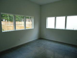
With a husband who travels approximately 300 days a year, it's rare that the two of us find ourselves at home together...alone...without our son or errands to run. Today, however, was one of those rare days, so we made an appointment to go check in on our box house. And this time we actually got to go inside and walk around--we weren't those creepy people peering in the windows. Here are some of my amateur photos of the place (try to imagine it without the "staged" decor):


Master bedroom


Master bathroom (definitely larger than my current bedroom)


Master bath (second look): the tub is separate from the huge, walk-in shower...
Calgon take me away!


Master closet (possibly larger than my current bedroom...hello light!)


Catcher's bedroom: Yes. I've already assigned bedrooms in my mind--
our son would love the windows looking out into the backyard.